

Each week Spatial Source highlights the best that the internet has to offer.

The “What Powers the World Map” shared by Geoawesomeness summarises the world’s reliance on fossil fuels and the uptake of nuclear and renewables. Australia stacks up comparatively poorly and the map features Australia for its reliance on fossil fuels for 87% of its power, with only 15% coming from renewables. On the other hand, one of the world’s biggest exporters of fossil fuels, Norway, is actually run by 98% renewables.

Some clever time sequencing of Landsat data by geologist Zoltan Sylvestet has led to this animated GIF showing the changes in Peru’s Ucayali river since 1986 until now. The animation shows decades of sedimentary processes and the creation of billabongs in just a few fascinating seconds.

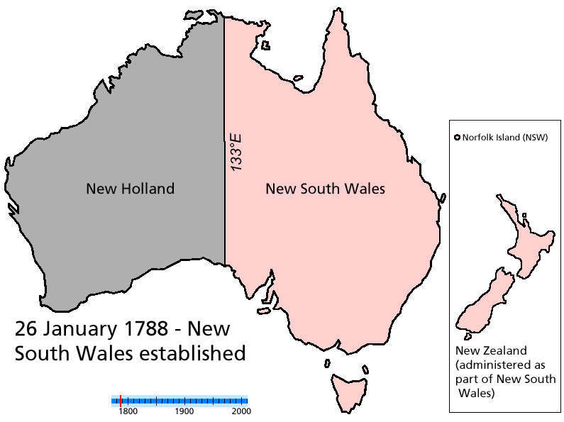
With the Australian Federal election now on its way, maporn Redditor rrushic turned to Australia, publishing this animated map showing the change in state governments since 1930. However, this doesn’t take into consideration the federal party, nor the evolution of Australia’s states like “Central Australia” and “North Australia,” as shown in this other interesting animated map.

The developers at Frame Synthesis have used Google Maps API to create a driving simulator embedded over satellite imagery. Using your keyboard, you can now drive around anywhere in the world as in Grand Theft Auto. Here’s me driving on top of the Sydney Opera House.

Watch this: this extremely dramatic video describes the various technologies devised at catching rogue drones. Solutions include electro-magnetic pulse guns, net canons, a specially programmed UAV, and the most effective of them all… Eagles trained to hunt drones.


