Each week, Spatial Source finds the best that the internet has to offer.

New continental maps combine the river data and simplistic design to expose the beautiful chaos of nature. Róbert Szűcs’s maps have been met with an amazing amount of attention and there is a simple reason for that… they are beautiful. The latest show the intricacies of river systems and colour-codes each watershed in a different, carefully chosen colour. [Geoawesomeness]

Satellite imagery is more than simply pictures. This GeoGeek’s Guide to Planet’s Satellite Imagery shows how small satellite technology is set to completely change the world- and how you can leverage satellite trends to make the most of these ‘images’. [Safe Software Blog]

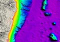
With the proliferation of open source web mapping tools out there days, GIS professionals and neo-cartographers are competing side by side. What could set them apart are the visuals. The Visualising Data website each month puts together a compilation of the best visualisations from around the web, including the above example from Marco Hernandez. And surprise, surprise: a massive proportion of the resources are map-based. [Visualising Data]

It seems that soon you will be able to 3D print anything. The next thing is likely to drones, with customisable parts for particular job types. sUAS News describe this advancement as “delicious” and a way to create an entirely new relationship between the drone designer and user. [sUAS News]

UK geographer Daniel Raven-Ellison has been trying to answer the tricky question, ‘How does the environment affect the brain?’. Daniel’s answer comes in the form of a map: he has been walking across the UK while wearing an Emotiv sensor which records his brain activity. The sensor records Daniel’s stress levels to map his ‘emotion timeline’ and location-based tweets. [Maps Mania]