Each month, we look back on the best of the month’s Best of the Blogs.

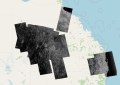
We talk a lot about caring for the environment, but the environment doesn’t always care for us. You see, there are locations where nature does quite the opposite. This story map shares some of the places on Earth that are so dangerous or extreme that simply going there would kill you. This includes Antarctica, where if you are exposed to the environment for more than an hour, you will probably die. [Geo-Jobe]

Can you locate North Korea on an unlabelled map? If you can, then you are more likely to favour a diplomatic and non-military response to North Korea than someone who can’t find it on a map. The New York Times asked 1,746 people to find North Korea on a map. 36 percent got it right. The map above plots real adults’s guesses for North Korea’s location. [Maps Mania]

Thanks to an error on Google Maps, a home in Australia’s Northern Territory was incorrectly labelled as a pizza shop .This promptly created many disappointed would-be pizza eaters and one very disgruntled home owner. “It is like getting your identity stolen,” homeowner Mr McElwee told ABC Radio Darwin. “I don’t know how many people have turned up at my house thinking it was a pizza place.” [ABC News]

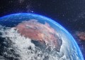
A new night-time map has revealed the Earth in a whole new light. By comparing satellite data from 2012 and 2016, it reveals where the planet has dimmed and brightened over the past few years. *Cough* India *cough*. [National Geographic]

US President Donald Trump has properties named after him in four out of seven continents. You could visit Trump Tower not only in New York, but also Toronto, Vancouver, Waikiki, the Philippines, Mumbai, Dubai, Istanbul and Ireland. But perhaps you would rather visit someplace that is the maximum distance from all the properties bearing Trump’s name. The Washington Post did some mathematics to find out just where that might be. [The Washington Post]

Reddit user Vinnivinnivinni posted an awesome amimated GIF of the Berlin Subway Map compared to its real geography. Maybe you’re not as close as you think. [Reddit]