The holiday season, 2016 and, of course, Star Wars: The Force Awakens, are just around the corner. It’s time to look back on the best that the Best of the Blogs brought to us in 2015.
Geoawesomeness featured the genius project that allows to shape the sand in a box with your bare hands, and have topo-lines and shading appear in near-real time, and then pour imaginary water over them for real time flood modelling. So. Freakin. Cool.
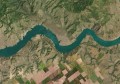
The Android icon shown pissing all over Apple, as well as features such as “Edwards Snow Den” atop The White House, has caused Google to pull the plug on the whole Map Maker project, as reported by the BBC. Fun while it lasted.
Jorge Rodriguez-Gerada is responsible for some of the biggest (and best) art in the world. So big, in fact, that it requires satellites to view. Google Earth Blog put together a KMZ file with some of the Rodriguez-Gerada’s most renowned works.
In response to the United States government’s decision to legalise same-sex marriage, Vox published a map showing the many countries that have passed similar laws to date.
Photographer Simon Norfolk traced the fiery fate of Nigeria’s Lewis Glacier using GPS surveys to demarcate the previous extents of the Glacier with burning petroleum and capturing it with long exposure photography, as shown above. Witness the stunning footage on The Story Institute to see the painstaking lengths he made to get the images.
Climate Central published a series of interactive graphics showing the difference in sea level rise between a +2 degree future and a +4 degree future. Things get deep, especially at the Sydney Opera House.
In the wake of the shocking attacks in Paris and the Middle East, media outlets did their best to convey the situation using maps. The Guardian created an interactive Mapbox scrolling article with OpenStreetMap data to show where each of the Paris attacks occurred, The Washington Post created custom maps and annotated aerial images and The New York Times showed how Paris was just the latest in a string of attacks, as shown by their global map and timeline.
Nearly 65 percent of the world’s land is held by Indigenous Peoples and communities, yet only 10 percent is legally recognised as belonging to them. LandMark is the first online, interactive global platform to provide maps and other critical information on lands that are held and used by Indigenous Peoples and communities.
And finally, I couldn’t help it, here are some Star Wars links to get you excited for you know what…
- The new TIE Fighter, converted into a fully functional UAV (UAV Expert News)
- The Star Wars Galaxy map – a 3D smart map,where you can travel through the entire galaxy far, far away (Esri Blog)
- And if you’re really into it, here’s even more Star Wars drones (Drone Life)