In light of the Covid-19 pandemic that has gripped the globe with the spread of the novel coronavirus 2019, we dedicate our regular Best of the Blogs segment to a roundup of the best and most interesting dashboards, visualisations maps and data journalism tracking the spread and impact of this virus.
Johns Hopkins Coronavirus COVID-19 dashboard

Center for Systems Science and Engineering (CSSE) at Johns Hopkins University
The pre-eminent tracking tool, Johns Hopkins’ ArcGIS-based dashboard has been tracking the spread of COVID-19 since its initial outbreak in China and has become the go-to source to slice and dice the latest data. It has been updated on March 23 to include more granular US data and a range of new features.
World Health Organisation Novel coronavirus (COVID-19) situation dashboard
 World Health Organisation
Simpler and less granular than the Johns Hopkins dashboard, the WHO tool is the source for the latest Covis-19 data available.
HealthMap: Novel Coronavirus 2019-nCoV
 HealthMap
Healthmap’s resource takes a different approach, collecting and presenting informal online sources geographically — using online media sources to provide real-time monitoring of emerging threats to public health.
 Kenneth Field
The one and only Cartonerd has created a Coxcomb map as a novbel means of presenting Covid-19 cases by country. Read his comments about this approach on the ArcGIS blog here.
 The New York Times
A spectacular piece of data storytelling that describes the spread of Covid-19 from Wuhan with devastating precision and elegance.
Coronavirus versus global air pollution
 Gizmodo Australia
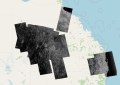
The clever folks at Gizmodo have created a series of maps based on Sentinel 5P data demonstrating the drastic effect that lockdowns and social distancing measures are having on carbon emissions across the world.
Coronavirus Shelter-in-Place & Stay-at-Home Orders on Google Maps

Randy Majors
Mr. Majors has created a real-time map displaying U.S. states, counties & cities with Stay at Home, Shelter in Place or Non-essential Business Closure orders in place.
 Map of the week
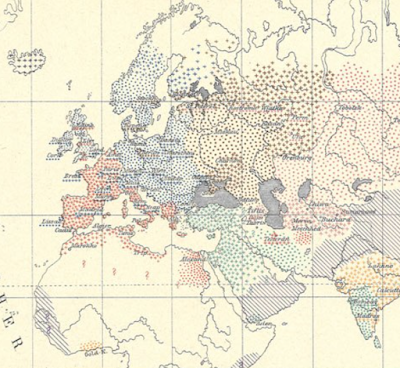
The ever-excellent Map of the week blog rounds up some interesting current and past epidemic maps to shed some new perspective on such events.
Stay up to date by getting stories like this delivered to your mailbox.
Sign up to receive our free weekly Spatial Source newsletter.