Where Americans are Wearing Masks
 Maps mania
The New York Times has created an interactive map which shows where Americans are wearing face masks down to the zip-code level. If you hover over a zip-code area on the map you can see the percentage of the local population which always wear a mask and the proportion who say they never wear a mask.
Online Map Tracks Nitrogen Dioxide Concentrations

The Map Room
A new online map tracks tropospheric global nitrogen dioxide concentrations—which we’ve seen drop sharply this year as the pandemic shut down economic activity. “This online platform uses data from the Copernicus Sentinel-5P satellite and shows the averaged nitrogen dioxide concentrations across the globe—using a 14-day moving average. Concentrations of short-lived pollutants, such as nitrogen dioxide, are indicators of changes in economic slowdowns and are comparable to changes in emissions. Using a 14 day average eliminates some effects which are caused by short term weather changes and cloud cover. The average gives an overview over the whole time period and therefore reflects trends better than shorter time periods.”
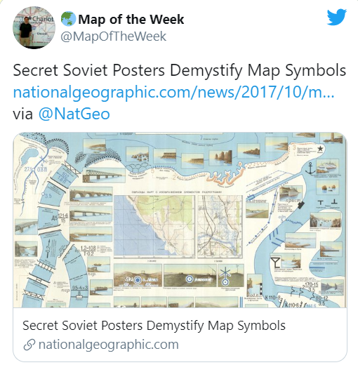 Map of the week
National Geographic shows some great 1968 posters from the Soviet Union’s United States mapping project. They beautifully illustrate how cartographic symbols translate to their real world features.
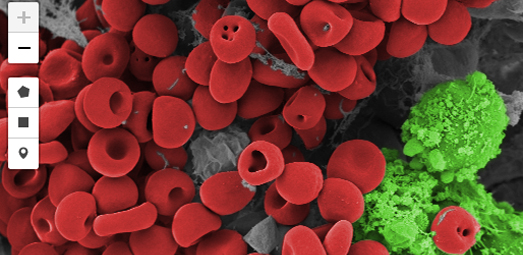 Maps Mania
Interactive mapping libraries are most often used to map very large entities, such as continents, countries and cities. Here are a few microscopic finds which can be viewed online thanks to the Leaflet interactive mapping library.
Real-Time Transit Maps on Circuit Boards
 The Map Room
Harry Beck’s original London tube map was inspired by circuit diagrams, so it’s only fitting that TrainTrackr’s tracking maps showing the real-time positions of trains on the London Underground and Boston MBTA are literally circuit boards, using LEDs to indicate train positions.
Stay up to date by getting stories like this delivered to your mailbox.
Sign up to receive our free weekly Spatial Source newsletter.