JOSE DIACONO
Good cartography for online mapping is about what you show, how you show it and how fast.
No matter how current and correct your GIS information, such distractions as slow display, spidery fonts, obscure icons or cluttered symbology will turn off an increasingly demanding public. They just need answers.
Unfortunately, however, it is not possible to be all things to all people. There are significant tradeoffs to be made in performance, content and functionality.
On a recent trip to New York, Charlie Savage, the founder of social mapping website Mappbuzz, used Google Transit to find out how to get from A to B using public transport. Similar sites are springing up all over the world. According to Savage, a good public mapping website has to be ‘the obvious things – fast, intuitive, easy to navigate, nice graphic design – but it shouldn’t overwhelm the user, either with data or unfamiliar concepts’.
A classic GIS interface offers a list of sometimes hundreds of layers that can be turned on or off. GIS professionals understand that, but most people do not.
‘When we conducted usability studies for an online mapping system…almost no one understood that there were multiple layers, let alone how to turn them on or off,’ says Savage.
Susan Kempson agrees. ‘Remove GIS jargon such as previous extent, imagery and layers,’ she says, ‘and ensure that the site can be used without a mouse.’
Kempson is leader of the spatial systems team in the Business Information Systems branch at the City of Melbourne, which is preparing to deliver unparalleled access to the city’s spatial information through a new online mapping platform. It will provide business locations and points of interest, and allow users to find out detailed and current information about a property. City residents will also be able to inform Council – for instance, about a pothole – by marking it on an interactive map.
Once they have located what they want, the user can link through to Council’s main website for information such as operating hours, required permits–or to plan a walking tour that highlights features of interest along the way. If they click on the That’s Melbourne event website, they will find details of current events, and ticket prices of tourist attractions. The goal is to improve the quality of information available, making Melbourne a great city in which to live or work, or to visit.
After spending 10 years acquiring and improving a wealth of spatial information for its own use, the city resisted the temptation to push everything out using online GIS. The belief was that too much complexity would clutter up the mapping site and make it harder to use. ‘Less is more,’ advises Kempson. Significant time and effort went into researching who would really use it.
‘We put ourselves in the shoes of new parents, residents and property buyers, who would each be asking differing questions like: “Where is the nearest childcare centre?”, “When is my garbage collection?” and “Should I buy this property?” or “What details do I need to progress the sale?” We then val dated our assumptions with focus groups,’ says Kempson.
To ensure continuing funding, it was essential to tie customer benefits back to business advantage. These included reducing customer contacts, improv ng efficiencies, and saving time and money.
Community and stakeholder feedback indicated that people wanted to know about garbage and waste collection, community groups, permits, road closures and the city’s Docklands development. The decision was made to leave out electoral regions (local, state and federal) and school catchment areas.
As a cartographer with Council’s Property Services Branch GIS team, it was Catherine Flower’s job to make the maps appealing and fit for purpose.
With the huge wealth of spatial data available, she had to decide what information was meaningful to display, at what scale, and what symbology to use.
When creating maps for a printed brochure, Flower would normally hand over a spatially correct map to a graphic designer, who would add polish and produce a one-off static map – perhaps to match a particular marketing campaign.
But web mapping is a whole new ball game, with maps produced on the fly. There is no time to import data into a desktop publishing product, and the cost of managing updates would be prohibitive. For the first time, Flower had full control and responsibility for the end product. Her solution had to look good, feel familiar and display quickly. While she holds a double degree in Geomatics and Science, Flower was now stepping into the realm of art and design.
‘The best way was to create maps in a style that is already familiar to the public,’ she said. For Melbourne users, that meant Google Maps, Whereis and the Melways street directory. She looked at the ways that these sites used colour and how roads were represented at different scales. This wasn’t always consistent. In Google Maps and Whereis, freeways are orange, but in Melways they are green. Flower went with green.
She made two important choices: ESRI Cartographic Representation for appearance, and seven set display scales to avoid the performance overhead of continuous scaling. The aim of cartographic representation is to create a more understandable, attractive and useful map. Symbology intelligence is stored in a geodatabase that allows features tobe displayed in a more meaningful way, depending on rules and display scales. Multiple representations can display features differently on different maps without creating additional files.
At larger scales, an example is, an offset on the Tourist Shuttle Route feature class that depicts the side of the street on which the shuttle runs. However, at smaller scales, the route is depicted down the centreline with direction arrows.
Flower describes cartographic representation as ‘a beast to get your head around, but well worth the effort’. It follows rules and geoprocessing tech niques to create richer and more customisable symbology, rather than relying on static attributes, she adds.
Symbols are offset to avoid crowding, and exception rules can dictate a choice of symbology.
Savage also stresses the importance of graphic design. ‘Icons are really important. They add colour and interest to a site – but they can be tricky. You don’t want them to be too big, but at the same time they need to be obvious on the different map, satellite and combined backgrounds.’
Performance is an area where some of the most significant tradeoffs have to be made. Savage explains: ‘High-end GIS can render customised maps for individual users. Each map can use different symbols, line weight and colours and show different types of features. This scales well because each user has their own desktop GIS to render what is shared in the backend database.’
In online mapping, this breaks down. To produce custom maps for each user, your server farm will be constantly rendering maps, which is very expensive in CPU time. Thus, any large-scale online mapping system uses pre-rendered tiles. But with such tiles, you lose the ability to customise cartography for each user.
There is a middle ground, however, where you define a few different map types, each with its own cartography. But you have now made your tiling system more complicated, and increased your data storage needs for the tiles.
At the City of Melbourne, Flower chose seven display scales. Certain core layers – such as roads – are always displayed. Property boundaries and building footprints appear at larger scales. Down the track, dynamic layers such as off-the-leash dog areas and parking permit areas will be added, but for now the emphasis is on simplicity. Seven images, one for each scale, were created from ArcMap MXDs into Jpeg2000 for web delivery using ERDAS’s Image Web Server. Jpeg2000 is an intelligent compression format that enables a spatially referenced image with Map Grid Australia co-ordinates.
Serving up a static image over the internet for layers that do not change much – rather than drawing every individual cartographically complex GIS layer – greatly improves performance. Council is keen to highlight the data quality and accuracy of its online mapping platform, which is powered by Cohga’s Weave. It has detailed information about buildings of interest and major tourist sites such as the MCG.
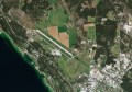
Council purchased aerial imagery from 2002, 2005 and 2008. While some applications allow users to turn imagery on and off, City of Melbourne maps use a slide bar to gradually display superior imagery over the vector map. They can also move between imagery from different dates. This is especiallyuseful to track changes around Docklands.
There is much more in a mapping website than meets the public eye. Anticipating the most common questions and creating fast, simple answers from complexity is a new challenge for the digital cartographer. You will know you have succeeded if the public keep coming back.
Jose Diacono is a Sydney-based freelance writer and communications consultant specialising in spatial systems.
Issue 43; October – November 2009