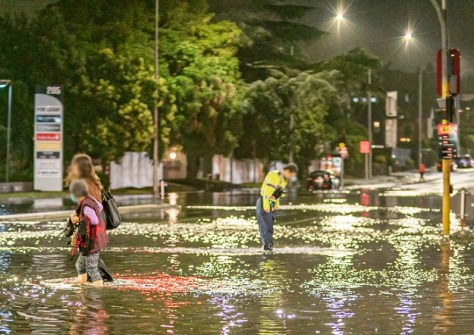
Most public flood maps still focus almost entirely on how deep water becomes, not how quickly it flows.
That’s according to Postdoctoral Fellow Dr Lea Dasallas at Te Whare Wānanga o Waitaha | University of Canterbury (UC), leader of new research into flooding in city environments.
“Floodwater doesn’t just pool — it flows, and when it flows quickly, even relatively shallow water can become extremely dangerous,” says Dr Dasallas.
As climate change drives more intense rainfall, the researchers say city authorities need to rethink how they plan for floods, shifting from static flood maps to dynamic models that show how water moves through transport networks in real time, taking flood velocity into account.
False sense of security
The research was undertaken as part of a Horizon Europe funded project called the Minority Report, which is dedicated to enhancing the resilience of vulnerable urban populations and their built environments against disruptive climate events.
Using central Wellington as a case study, the team modelled an extreme rainfall event under future climate conditions. When water velocity was added to the models, previously ‘safe’ roads and intersections emerged as high-risk zones, especially in areas where streets effectively act as channels for fast-moving water.

“These are places people still try to drive through or walk across,” Dr Dasallas says, “but once you account for velocity, it becomes clear that those routes are much more dangerous than they appear.”
“When flood velocity is included in the assessment, the areas classified as high risk for people walking increased by more than 80 per cent. Medium-risk pedestrian areas, including for children and older people, more than tripled,” Dr Dasallas says.
Better flood modelling
The study, published in the Journal of Flood Risk Management, didn’t stop at identifying hazardous streets. The team overlaid flood risk maps onto the transport network to test whether people could still reach essential services during the peak of a major flood.
The team looked at access to hospitals, public transport hubs and key bottlenecks in the central city. Under depth-only flood modelling, most of the population appeared to retain access.
However, when flood velocity was included, some regions in the Wellington CBD that still had access in the depth-only assessment are now shown to be cut off, especially for pedestrians.
In some scenarios, nearly all walking routes to key services were deemed unsafe during the flood’s peak. Vehicle access was also significantly reduced, particularly where steep terrain and narrow routes created choke points.
Data dashboard
In the Northern Territory, one of the biggest obstacles to rebuilding a community’s resilience after natural disasters, is the ability to gather timely data.
A series of workshops to be held in early March — hosted by Charles Darwin University’s Northern Hub and University of Canberra for the Early Insights for More Resilient Communities project — will bring together researchers and community members to co-design a data dashboard unique to the needs of the Territory.

Northern Hub Knowledge Broker, Dr David Gallacher, pointed to recent flood evacuations from Daly River as an example of where such datasets may be useful.
“The floods bring the media attention, but often the real struggle starts after the floods have receded and people start to rebuild what they’ve lost,” he said.
“Having a data dashboard designed to collect early insights from the Daly River community would show sometime in the next year if the community as a whole is coping.”
Painting a picture
National datasets such as those provided by the ABS can already be used to see which communities show signs of disadvantage, but these often rely on data that is several years old — meaning it does not provide an accurate snapshot of recent trends.
Tailor-made dashboards would give researchers and residents the ability to collect data that paints a clearer picture.
“The dashboard would show if there’s a sudden drop in school attendance, capacity to pay bills, participation in community events, or whatever metric the project comes up with,” Dr Gallacher said.
“It’s easy to say that a community hasn’t recovered from an event, but without data it’s all just anecdotal and not very convincing.
“This dashboard will provide annually updated data that shows when a community has fallen behind and means that when a community group says they need federal support, they’ve got data to back their claim.”